I don't just design screens. I design the system that makes them work.
A selection of projects across different contexts: complex software, operational workflows, data-driven products and visual direction. In some cases the output is highly visible. In others, the best work is what the user no longer has to think about.
From product catalogue to brand experience.
Edilarte Piracci is a family business with fifty years of experience in home furnishing and materials. The existing site was essentially a product catalogue. The new project had to bring the quality of their showroom, their expertise and their curation of brands online.
See the live site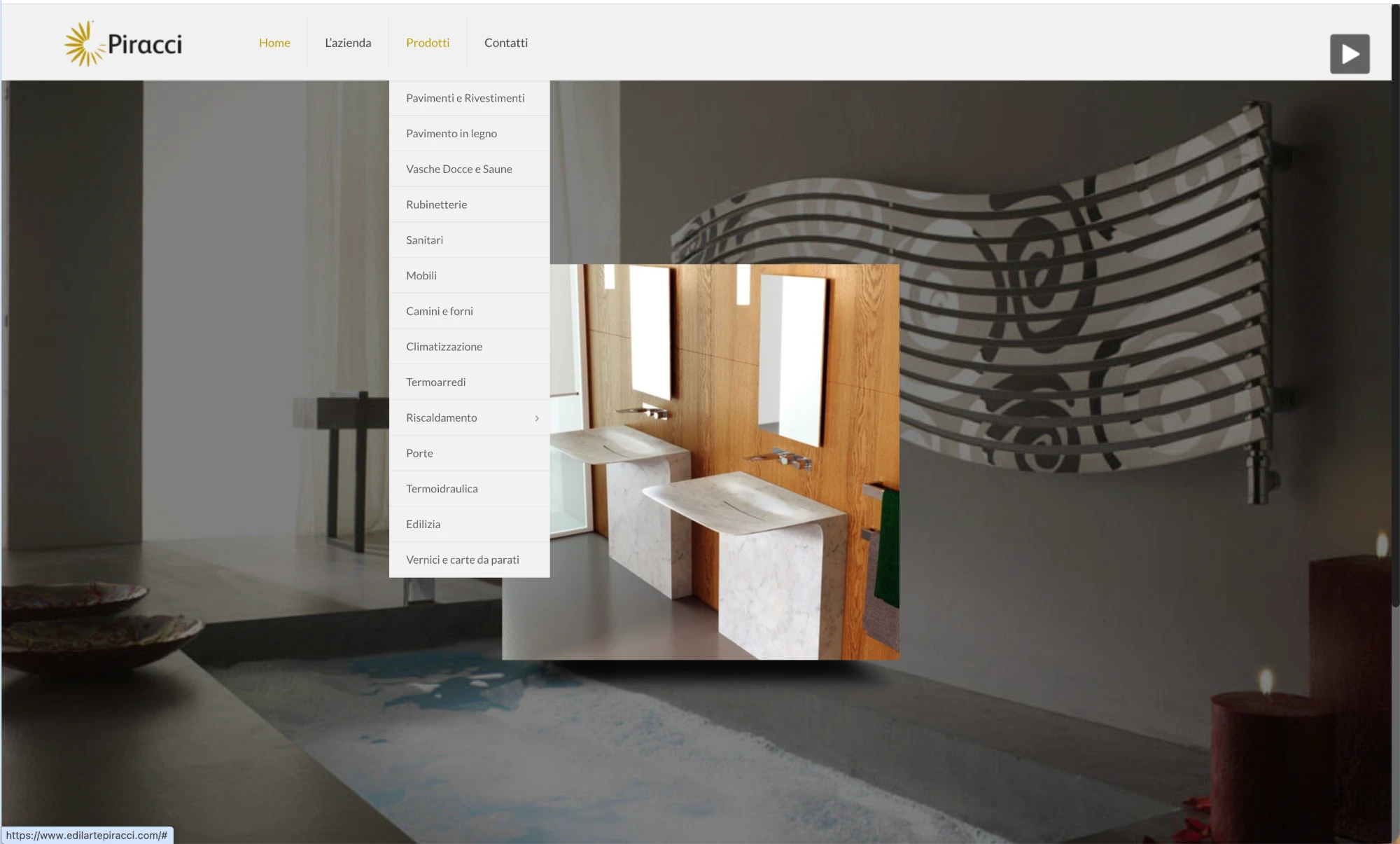
Many categories, little hierarchy, images used mainly as catalogue and a digital experience that didn't reflect the company's actual positioning.
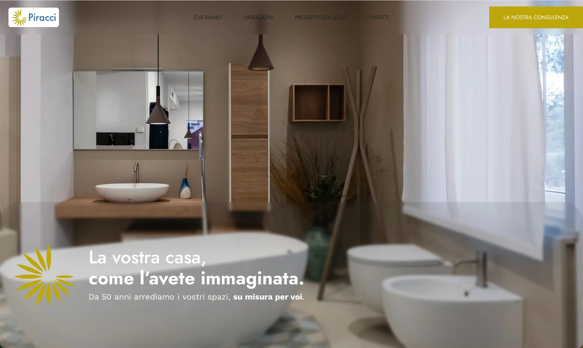
A more editorial direction, built on photography, typography, rhythm, space and hierarchy to bring the site closer to the showroom experience.
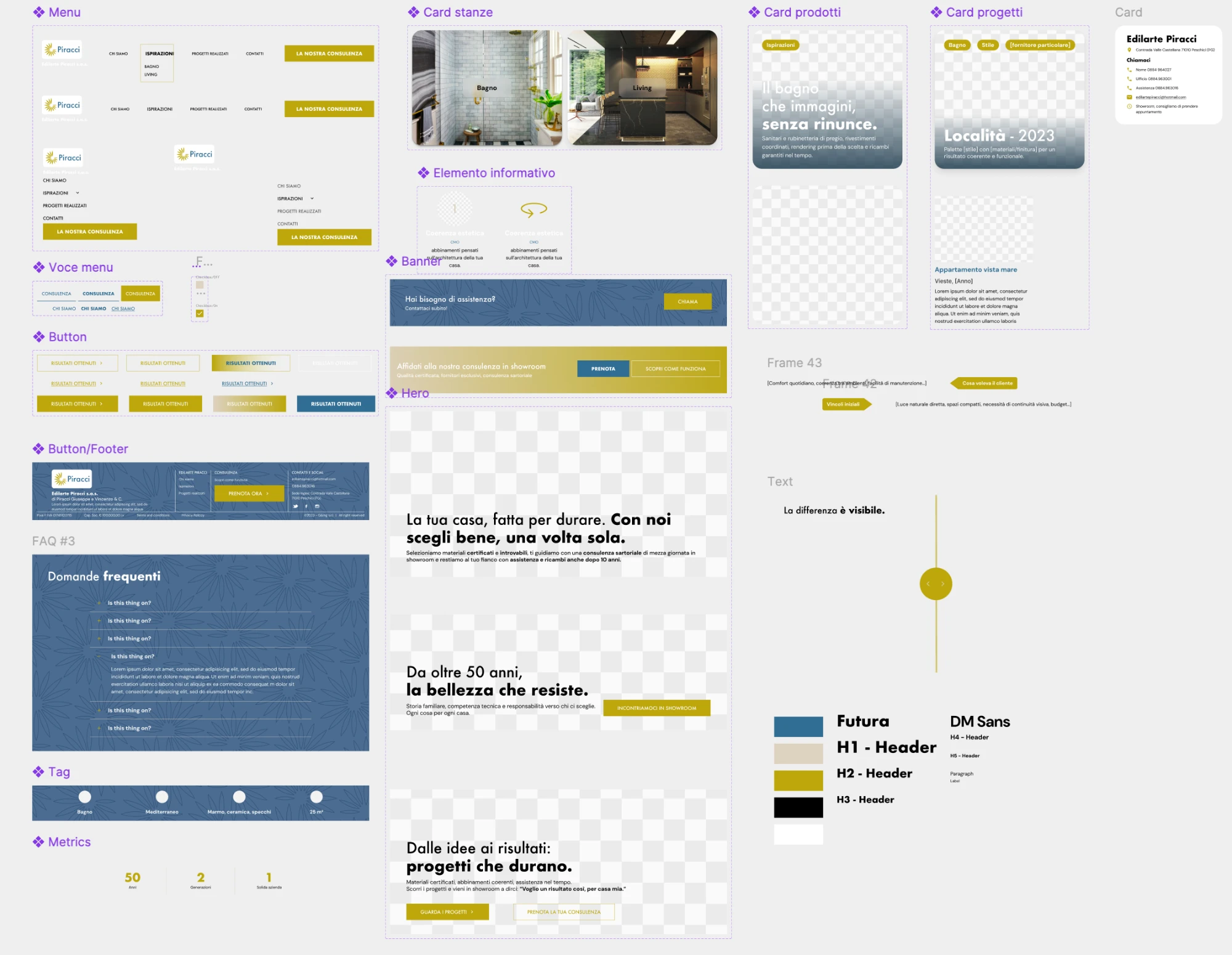
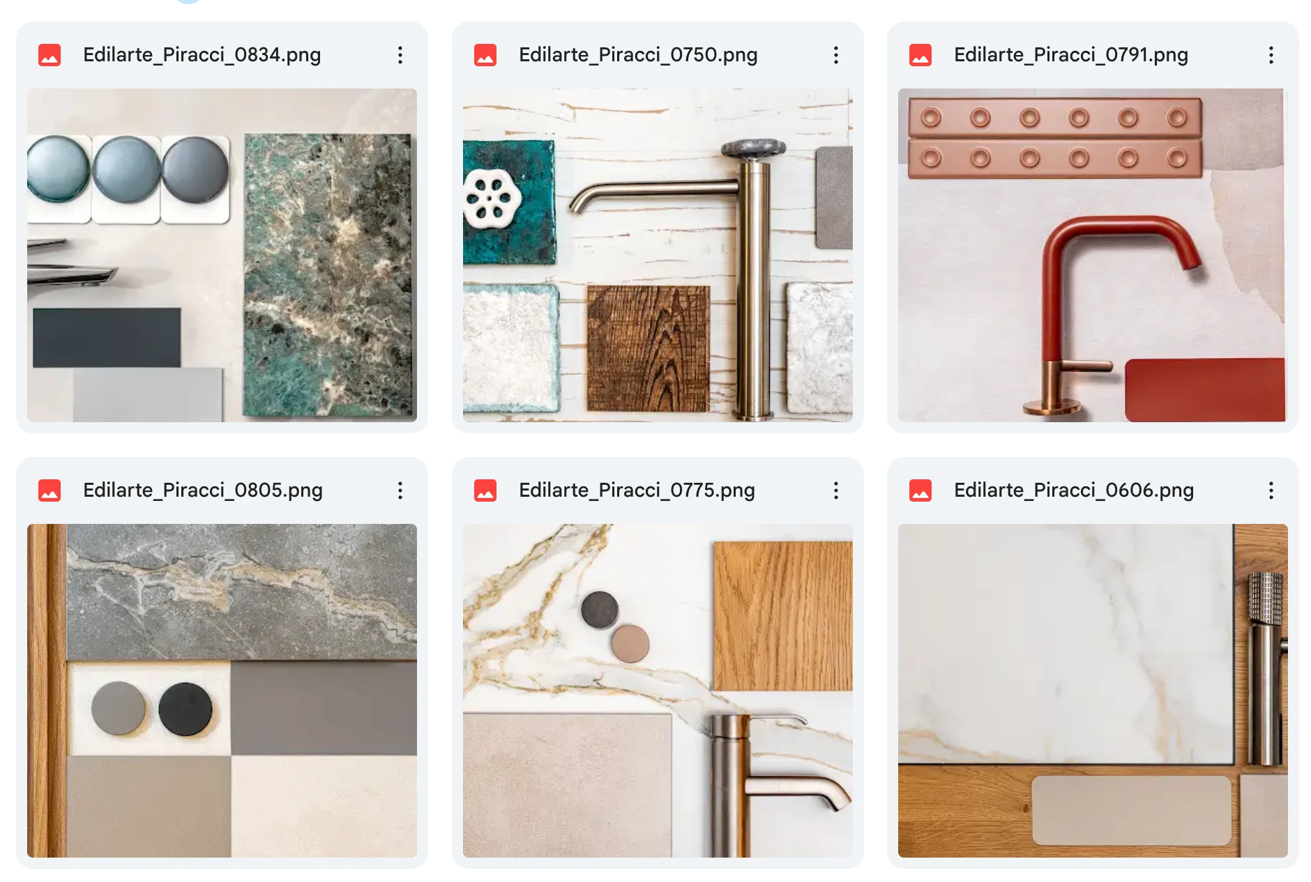
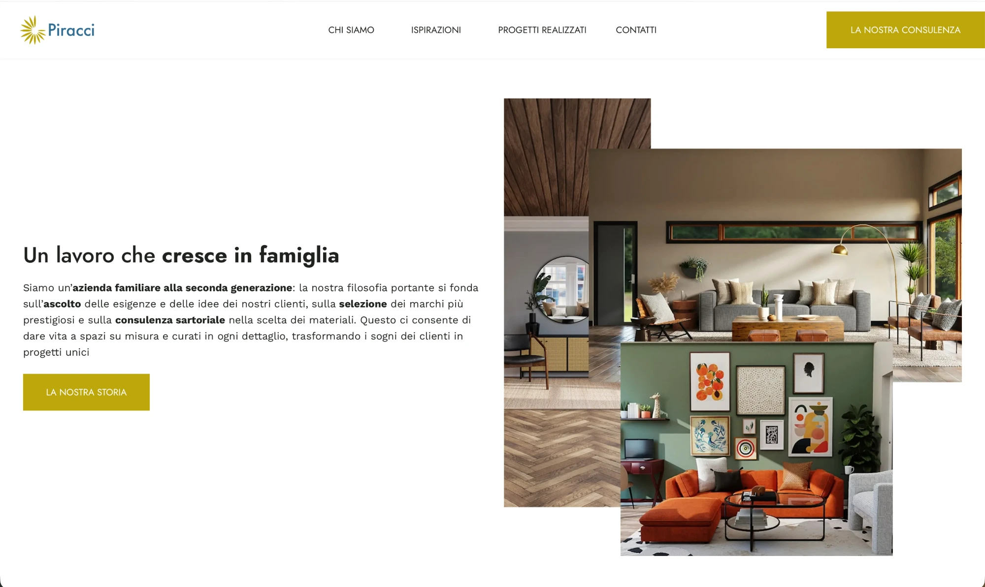
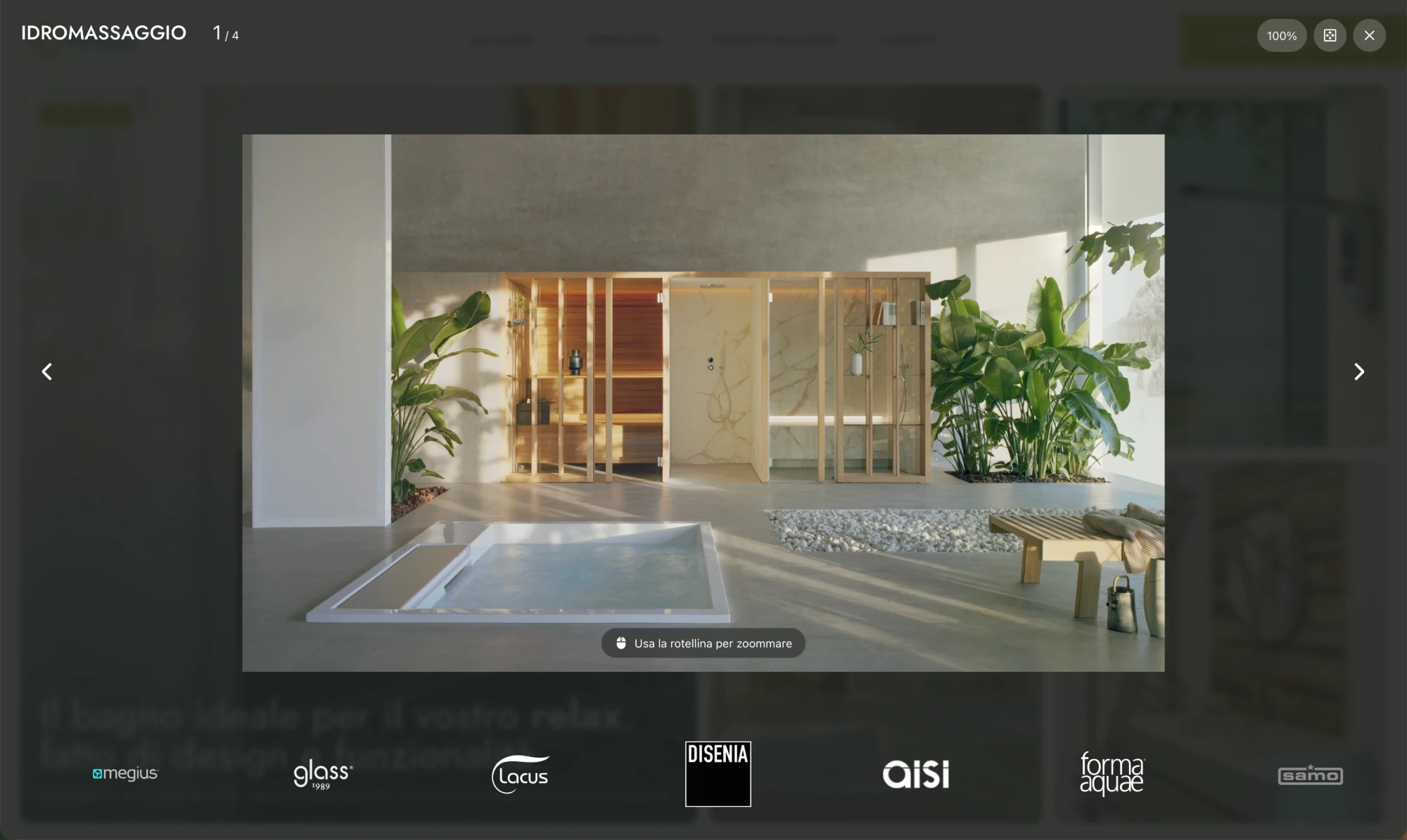
The site is still being completed: some photographic and product content is awaiting delivery from the client.
From a showroom for other brands' products to a story about consultancy.
The old site displayed other manufacturers' products and linked directly to their own websites. The problem wasn't aesthetic: it was positioning. Edilarte is not a retailer that shows catalogues: it's a family business that selects major brands, pairs them to each client's specific needs and accompanies them from concept through to post-purchase. None of this came through on the old site. The new one is built to make it unmistakable: the consultancy is the product, the brands are the tools.
Reduce the noise
From a catalogue of categories to a few high-intent entry points. Fewer choices, clearer positioning.
Give images more space
Visual material becomes part of the hierarchy, not decoration. Photography and material combinations as identity elements.
Build recognisability
Typography, composition and rhythm used as identity rather than relying on a neutral template that would look like any other retailer.
One system to coordinate people, information and operations.
A custom management system for a distributed network of healthcare sites. Multiple roles, multiple schedules, multiple data flows that had to converge in a single operational interface without requiring extensive training.
Real project · selected details have been anonymised for confidentiality.
A single action in the portal propagates data across three different surfaces in real time. The operator who updates their hours doesn't know they're simultaneously updating the institutional site, the communication to the competent public authority and the web app a citizen will use at 2 AM to find the nearest open site. They don't need to know. They just need to change the hours.
01 · Three surfaces, zero synchronisation
Hours, schedules and regulations lived in separate systems. Every update required manual intervention in each one. Misalignment errors were frequent and visible to citizens.
02 · Schedules built by hand
The schedule coordinator built duty rosters manually for dozens of sites on a two-year basis. Every change required recalculating the connected schedules from scratch.
We designed the flow before designing the screens.
The data model and propagation logic were defined before drawing any interface. The goal wasn't to build a management system; it was to make one action in one place update everything else without the operator having to think about it.
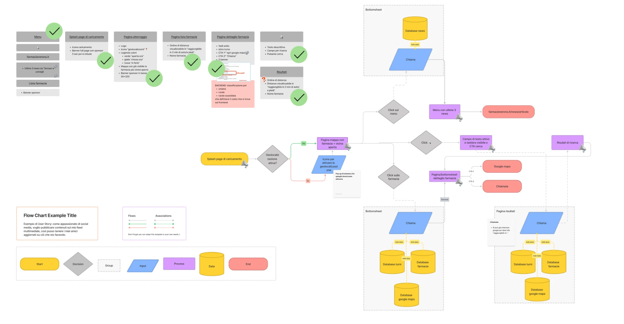
Complete user flow: from splash page to the nearest open site, with both paths (geolocation active / inactive) and the databases connected to each screen.
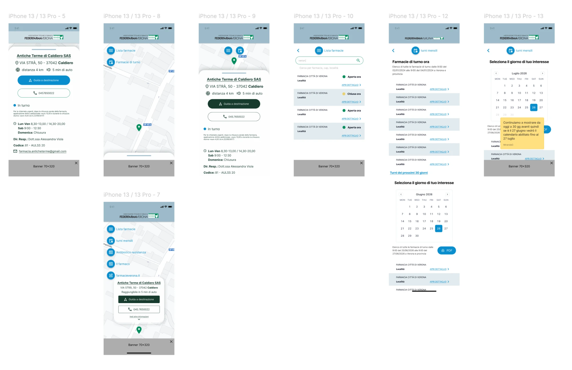
Citizen web app: nearest site geolocated, real-time status (open, on duty, currently closed, on leave), monthly schedule with navigable calendar.
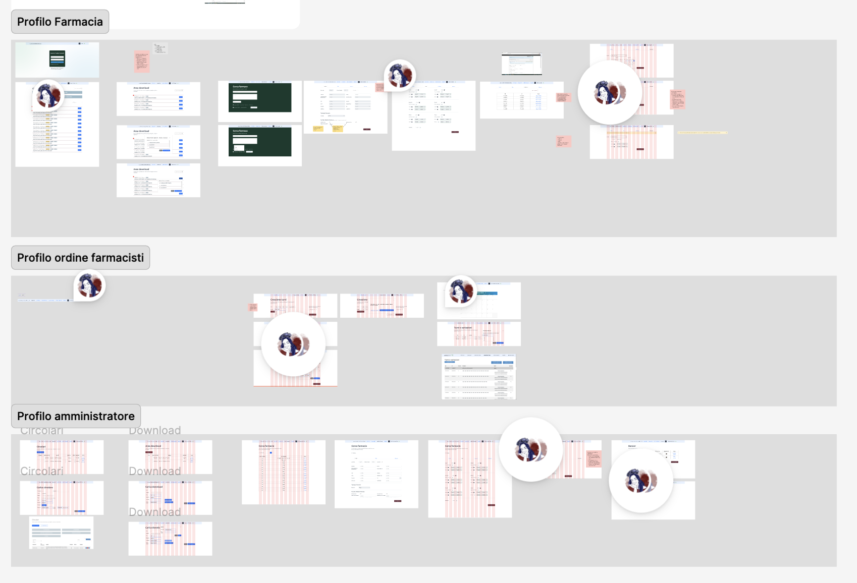
The operator portal structured around three profiles with distinct access levels and capabilities.
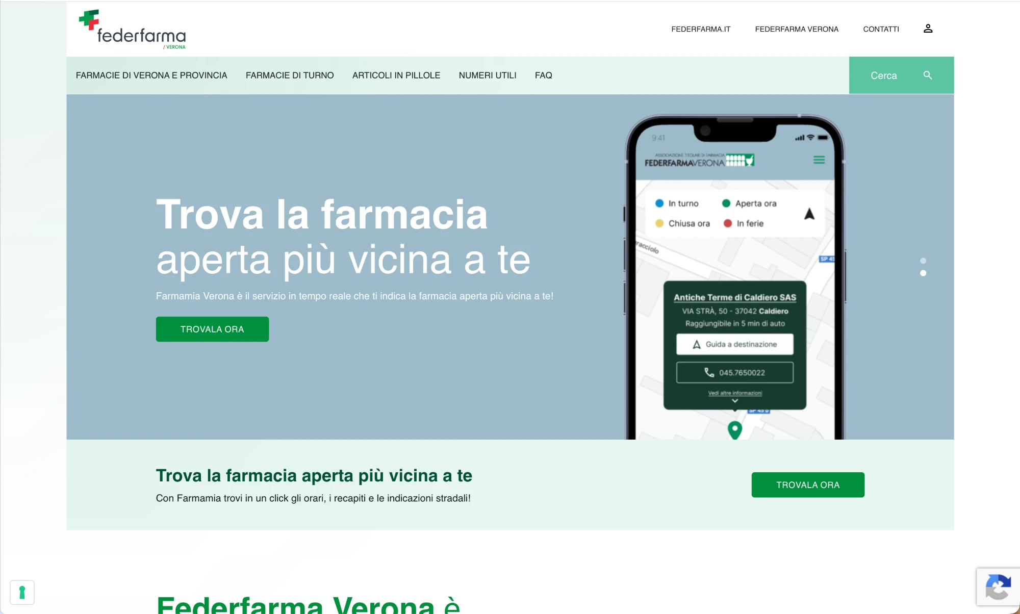
The institutional site: one of the surfaces that automatically receives updates whenever the operator portal is changed.
When the management system becomes the place where the work actually happens.
CRM, quotes, sales, rental, availability, automations and activities all lived in the same Odoo ecosystem, but not necessarily in the same flow. The project wasn't to configure Odoo. It was to translate operational requirements into system behaviour.
CRM: turning an opportunity into a tracked flow
Every lead had to generate automatic activities assigned to the right sales rep, with visible deadlines and a status that could be updated without leaving the client view. The operational need: no leads lost to oversight or lack of visibility on current state.
Quote: from conversation to document in one step
The quote had to reflect real-time availability, current pricing and margins, and be sendable directly from the management system with integrated digital signature. The previous problem was the distance between negotiation and the formal document.
Rental: availability, payment and verification in one flow
Booking a vehicle required checking availability, collecting a deposit, verifying client documents and confirming, often at separate times and through different channels. The project unified these steps into a sequential flow with explicit checkpoints.
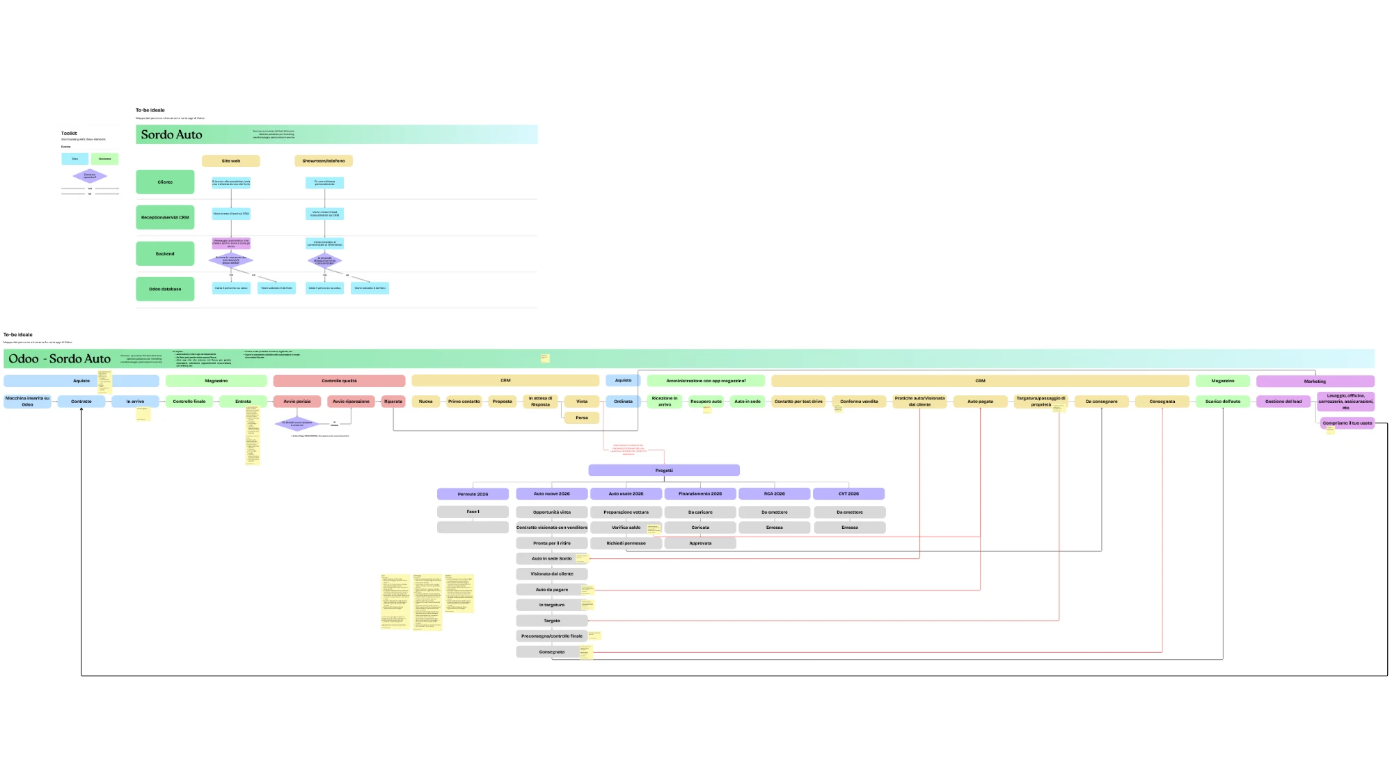
To-be ideal mapping: sales flow (CRM, quote, order, warehouse, delivery) and rental flow (booking, verification, plates, return) with actors, states and automations.
Sometimes the best decision is to redesign nothing.
The site had been live for years, traffic was coming in, conversions weren't. The temptation was a full redesign. The audit showed the problem was structural, not visual. Recommending less than the client expected was the hardest and the most correct decision.
01 · A site that talks but doesn't convert
The offer was clear to people who already knew the consultant, not to those arriving cold. Weak CTAs, misaligned operational flow, information hierarchy that needed rethinking.
02 · Budget at risk on the wrong problem
A full redesign was on the table. Significant investment to fix a visual problem that was not the actual cause of the low conversion rate.
Deliver less than the client expected.
UX audit and gap analysis made it clear the problem was structural. The roadmap separated three levels: what to do now (CTAs and operational flow), what not to do (full redesign), what to defer (visual restyling). In parallel, a new dedicated landing page aligned with an advertising specialist.
Targeted interventions on the main friction points. Priority change checklist, alignment with an ADV specialist, new landing page with an optimised flow.
Approximately €3,000 in budget saved. The problem wasn't aesthetic, and a redesign would have consumed resources without fixing the actual cause of the low conversion rate.
To be evaluated after measuring the impact of the structural interventions. Conversion data is incoming: ad campaigns need time to produce a reliable signal.
Could be yours.
Tell me the context in three lines. If it's a good fit, we start with a triage.